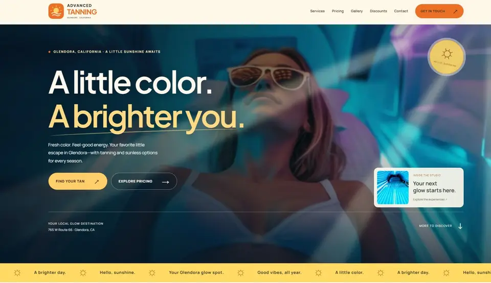
Tanning & wellness studio
Advanced Tanning
A Glendora salon with more than beds: infrared sauna, hydration therapy, body wraps and red light. Each service explained in a sentence, with contact one tap away on a phone.
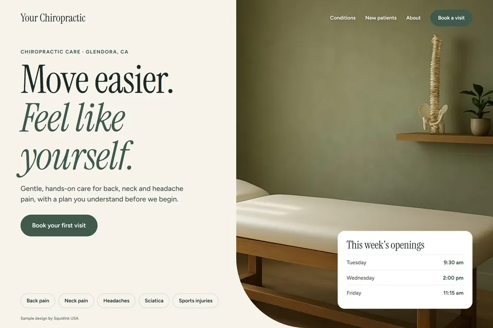
West Covina is a busy retail market, and people choose quickly. Your site should say what you offer, which insurance you accept, how payment works and how to book in a few taps. We build chiropractic websites for West Covina practices around Plaza West Covina and along the 10 freeway corridor.
Many people checking a chiropractor want to know whether their plan is accepted before they call. A clear insurance page lists the plans you take, names the ones you don't and says what to do if a plan changes. You write those lines and keep them current. We don't decide your billing rules, but we design the page so the answer is easy to find and easy to read on a phone.
Explain how payment works in one short block: which cards you take, what is due at the visit and whether a deposit applies. Keep the booking button right next to it, so the next step is obvious. Any payment or booking link goes to the provider you already use, and nothing is charged through the website unless you set that up yourself.
A visitor near Plaza West Covina or driving along the 10 freeway may have only a few minutes to decide. The page should open fast, show your name and location at the top, and answer what you offer and why it suits them in the first screen. A short list of services with one line each, then a clear way to call or book, works better than a long brochure.
Chiropractors are a new specialty for us, so this is a sample design rather than a client site. The live sites below use the same mobile-first, local-SEO approach yours would.
A Glendora salon with more than beds: infrared sauna, hydration therapy, body wraps and red light. Each service explained in a sentence, with contact one tap away on a phone.
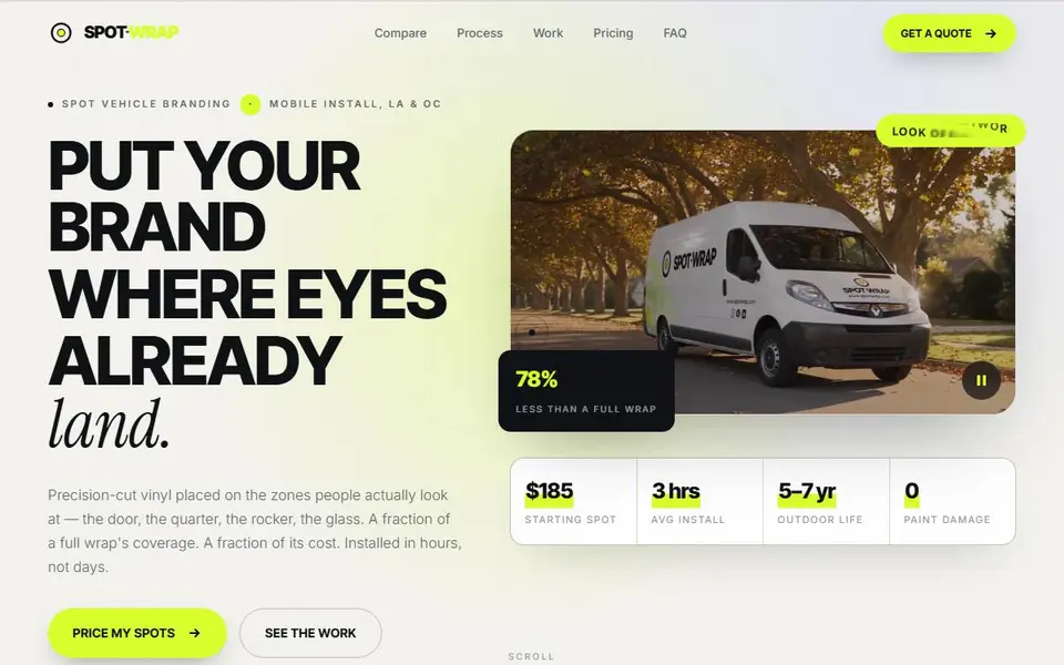
Partial vehicle wraps, priced in the open. An interactive map of the zones worth branding, a live cost calculator, and a quote form that takes photos of the customer's van.
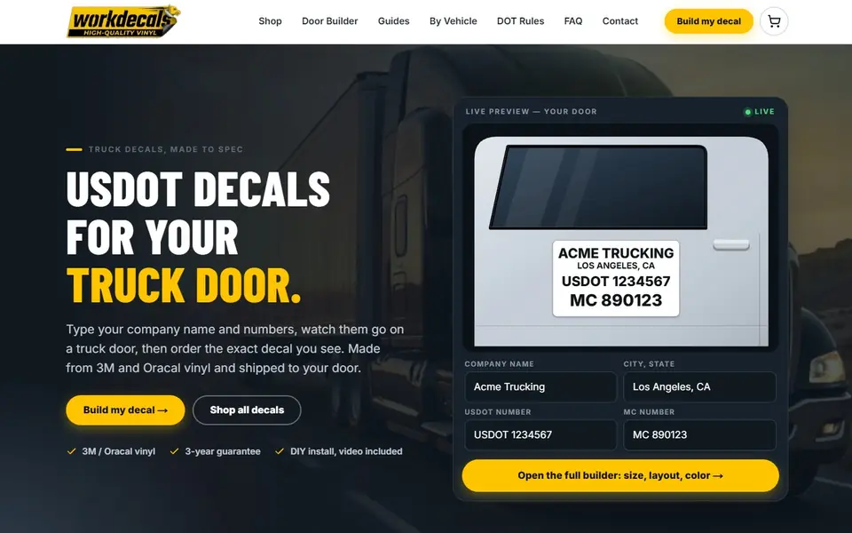
Door lettering that passes inspection. A two-minute decal builder with a live door preview and an FMCSA compliance check, prices that update as you type, and an emailed proof for ready-made logos and door sets.
List the main plans and add a line saying the list isn't complete. Plans change, so tell people to call and confirm before booking. Don't guess at coverage, and don't promise that any visit will be covered.
Only if you want to and your office has confirmed them. Some practices state a first-visit fee on the page, while others explain fees on the phone. Either way, the website and your booking software should show the same information.
Your name and location, what you offer, why patients choose you in your own words, and a clear way to call or book. Keep everything else one tap down. Busy visitors decide fast, so the first screen should answer the basic question.